|
|
Post by Jindred on Aug 5, 2015 14:02:40 GMT -5
|
|
|
|
Post by Divebitch on Aug 5, 2015 18:09:01 GMT -5
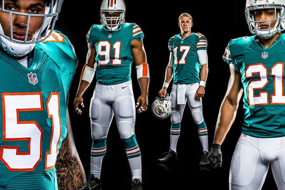
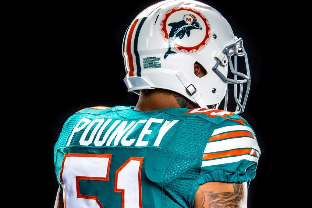
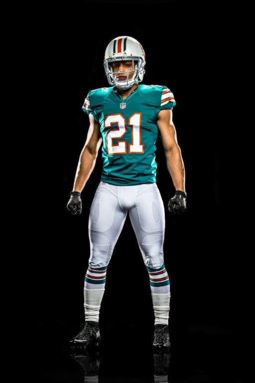
Throwbacks?! I don't even see a difference except for the stripes in the shoulder. Nice they resurrected that dolphin from the dead, which ain't what they're aiming to sell. Is that Cameron Wake, ya know, the side view? Breathtaking.
|
|
theWILLmckoy
Heisman Candidate
 WE LIVE AS KINGS, BUT JESUS IS GOD! - Swoope
Posts: 905 
|
Post by theWILLmckoy on Aug 18, 2015 17:22:15 GMT -5
New throwbacks? That's an oxymoron, no?
|
|
|
|
Post by nateball89 on Aug 18, 2015 22:00:12 GMT -5
Uh...that's what Nike SHOULD have given them in the fucking first place instead of those muted pastel Easter egg teal monstrosity eye sores. Hell, if they just switched the new logo, which I've actually come around to, on to these throwbacks, this should be their permanent new look. Some might say they don't notice any difference from these and the 90's Dolphins uni's, but compared to what they're currently wearing, these look SO much better. I will never get over what Nike did to all three of the Florida teams' uniforms.
|
|
|
|
Post by nateball89 on Aug 18, 2015 22:02:58 GMT -5
Seriously. Can't get over it. How did Nike and the Dolphins look at this and think their current Easter egg uni's looked better than this? These are a thousand times better!
|
|
|
|
Post by cityofchamps on Aug 19, 2015 18:09:51 GMT -5
All they need to do now is bring back the block numbers for the Steelers unis...
|
|
|
|
Post by Divebitch on Aug 19, 2015 18:33:05 GMT -5
Uh...that's what Nike SHOULD have given them in the fucking first place instead of those muted pastel Easter egg teal monstrosity eye sores. Hell, if they just switched the new logo, which I've actually come around to, on to these throwbacks, this should be their permanent new look. Some might say they don't notice any difference from these and the 90's Dolphins uni's, but compared to what they're currently wearing, these look SO much better. I will never get over what Nike did to all three of the Florida teams' uniforms. Guilty as charged. Don't catch a ton of Dolphins games, so the only thing that usually strikes me is the dead dolphin. They screwed with the colors a bit obviously. But can say with absolute certainty those pics above as good as any uni gets. Perfection from helmet to toe. All they need to do now is bring back the block numbers for the Steelers unis... Ya know, that was once my initial feeling. But I like the numbers cuz 1) they don't try to stylize them like that girly Ravens crap, or God forbid the Vikings or, OMG Bucs. 2) they are not outlined by another color. The black jersey is kind of a bad ass yet throwback look. The number could be a tad bigger though. |
|
|
|
Post by nateball89 on Aug 19, 2015 21:55:16 GMT -5
Why these aren't the Dolphins jerseys and the ones they currently wear are is fucking beyond me. It would be like the Bills going back to the all navy uni's with red helmets from what they're wearing now. Remember those? That's how much of a difference in quality and appeal there is here.
|
|


/cdn0.vox-cdn.com/uploads/chorus_asset/file/4330485/antoniowheee.0.gif)

